Graphic Design in Learning Experience Design
Graphic design is a key component of effective learning experience design. While visual appeal can increase learner engagement, the more significant impact lies in accessibility. Decisions related to color, typography, and overall layout are not simply stylistic—they are essential to ensuring that learning materials are inclusive and usable for all learners.
In the examples below, you will find explorations of color theory, typography, and layout principles. These design elements help transform a well-constructed learning experience into a cohesive and professional final product.
Creating a Color Palette
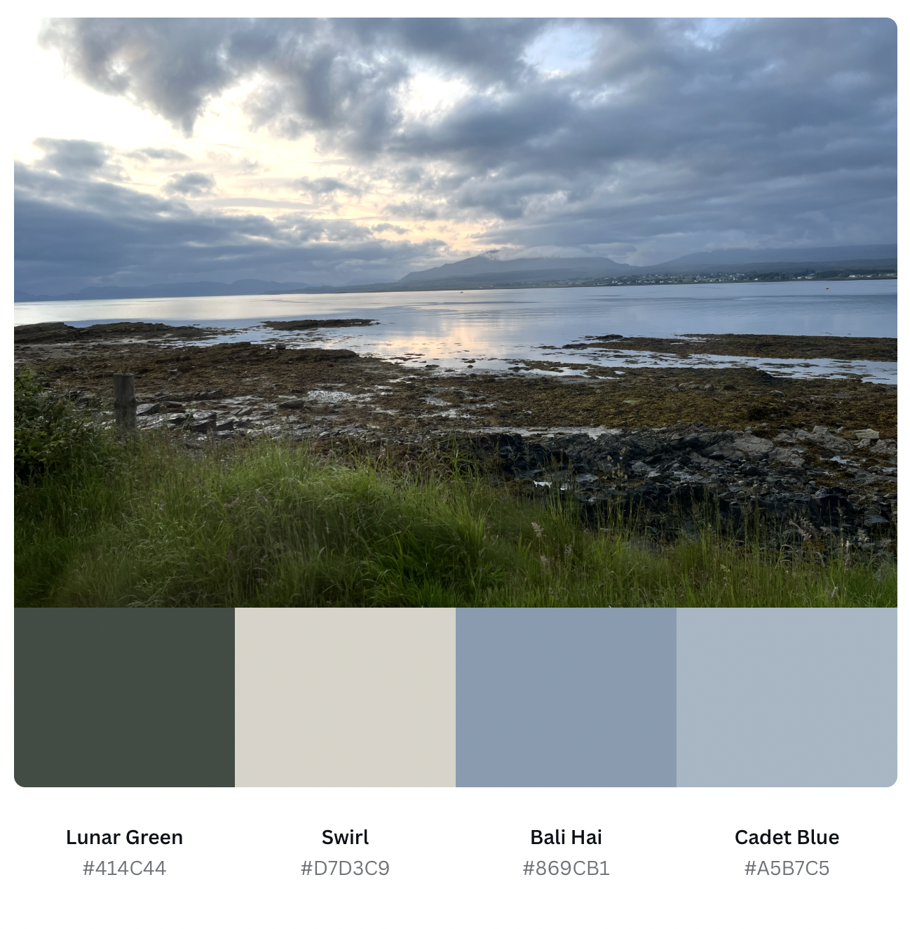
One of the ways to captivate your audience when designing, and to ensure your design is accessible to all learners is by using the right color palette. While this is sometimes provided by a brand, other times it needs to be created by the designer.
The sample to the right is a color palette I created using tools from the design platform Canva and a photo I took on a recent trip to Scotland. This analogous color scheme (a color scheme derived from colors next to one another on the color wheel) provides a great starting point to apply the 60-30-10 rule. You can click the button below to learn more about basic color theory from the site Colors Explained.
Duotone Print
The sample to the right is a flyer I created in Canva using a duotone effect on my own image. This particular sample explores the use of two shades, a light pale pink and a dark purple. With a duotone effect, the highlights of the original image are being tinted with the pale pink and the shadows are being tinted with the dark purple. The midtones blend the two creating a gradient for a dramatic and moody look. The sample also features a sample of typography mixing. For this poster, I combined a sans serif font, Lato, and the serif font, Playfair Display, to create contrast between the header and the name of the group. To learn more about Typography, click the button below to explore Inkbot Designs.

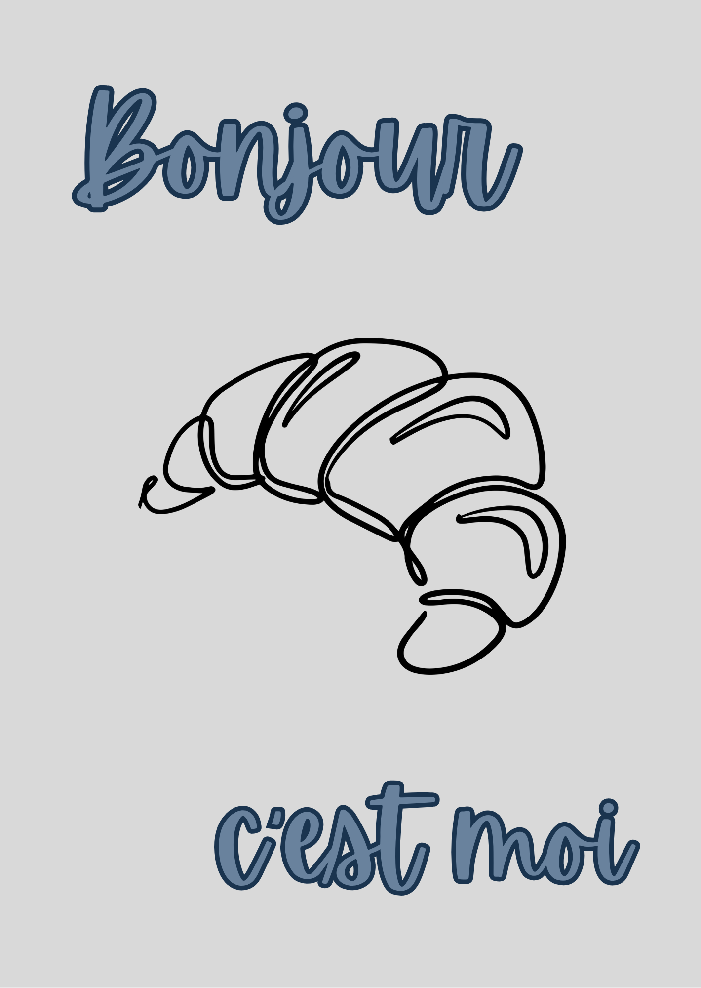


Layout – Kindle Cases
As an avid reader, I wanted to display some layout experiments in the form of kindle case inserts. In each of these designs, layout plays a key role in shaping the visual experience. The arrangement of text and imagery guides the viewer’s eye, creates hierarchy, and reinforces the tone of the message in each design.
In the Bonjour, c’est moi design, the vertical alignment of text and image creates a clean, friendly look. The centered layout and consistent spacing make it easy to follow, while the playful script font sets an informal, welcoming tone.
The I’d Rather Be Reading design uses a centered, circular layout that feels calm and cohesive. The curved text and open book illustration draw the eye inward, while the checkered background adds structure without distraction.
Each design uses layout intentionally to enhance engagement, support readability, and align visual elements with the purpose of the message.
Contact
One of my goals has been to deepen my understanding of graphic design principles in order to grow as a designer. I have never taken formal classes about design from any of the institutions I have attended. This page is dedicated to the samples I have been creating through self-study and online workshops through platforms like Udemy. Do you have a project that needs a graphic designer? I would love to talk to you about your vision.
Get in touch with me by clicking the button below.


